

Skip links

Real Packaging Case Study

Heritage Bee Honeycomb Window Cartons

A vivid folding-carton system designed to frame a premium Canadian honeycomb product, provide a direct product-viewing cue and keep the brand recognizable across two visible pack formats.

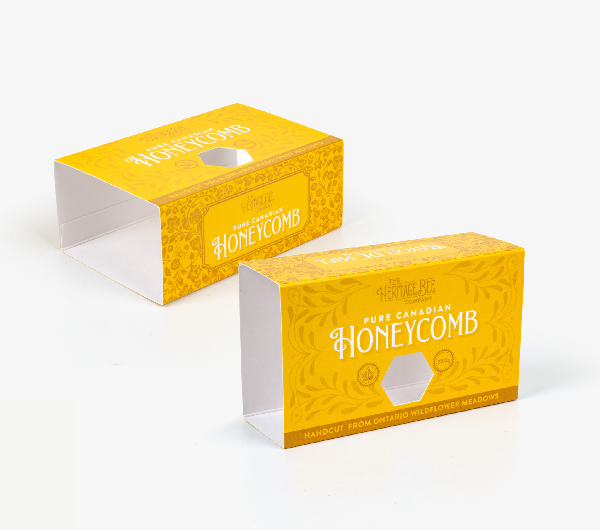
Heritage Bee Company Pure Canadian Honeycomb custom yellow folding cartons with hexagonal windows
Finished Pure Canadian Honeycomb cartons shown in two visible formats with hexagonal die-cut openings.
BrandThe Heritage Bee Company
ProductPure Canadian Honeycomb
Visible structureWindowed folding carton

What packaging problem does this case address?

The product needs a strong premium identity while helping shoppers understand that the carton contains an intact piece of honeycomb. The bright yellow printed system, floral linework and hexagonal opening create an immediate link between the package, bees and the product inside.

Visible packaging features

Hexagonal display opening

The honeycomb-shaped die-cut window reinforces the product story and creates a deliberate reveal area. Final window construction and any film specification must be confirmed around product protection and packing requirements.

Two-format brand consistency

Both visible cartons use the same yellow palette, typography, border treatment and Ontario wildflower message, helping the formats read as one coordinated product family.

High-contrast shelf communication

White product lettering stands prominently against the yellow field, while the darker gold border and botanical illustration add detail without competing with the main product name.

Product-specific visual language

The six-sided opening and floral ornamentation translate the origin and character of honeycomb into structural and printed cues rather than relying only on descriptive copy.

Business analysis: pain points and packaging response

Challenge: communicate an unfamiliar format

Compared with bottled honey, packaged honeycomb can require more explanation at shelf. The product name, hexagonal opening and visible white interior provide layered cues about what the shopper is buying.

Response: structure reinforces the story

The window geometry behaves like a brand asset. It echoes a honeycomb cell while giving the front panel a memorable focal point that can support recognition from a distance.

Challenge: maintain premium presence

A natural product can easily appear rustic or generic. The restrained ornamental pattern, consistent hierarchy and saturated colour create a polished giftable presentation.

Response: coordinated format system

Repeating the same identity across the two visible formats helps reduce visual fragmentation and allows future pack sizes to follow an established presentation system.

Planning a similar window carton

A quotation should confirm finished dimensions, product and inner-pack configuration, board specification, opening geometry, any transparent window material, printing coverage, coatings, packing method, order quantity and destination. Beneco’s standard minimum order quantity is 5,000 units.

Documentation note: This case describes visible features in the supplied production photograph. Exact paperboard grade, window film, printing method, coatings, dimensions, quantities and performance outcomes are not inferred from the image.

Prepared byBeneco Packaging Technical Editorial Team

ReviewedAugust 24, 2026 · Editorial Policy

Planning premium window packaging?

Share your product, dimensions, artwork, window requirements, quantity and delivery needs with Beneco.

Request a Quote