


Die-cut display window
A rectangular opening on the top panel provides product visibility. Window size, placement and any transparent film specification must be engineered around product protection, packing and retail requirements.
Real Packaging Case Study
A coordinated retail food-packaging presentation using windowed folding cartons to distinguish two Artisan Crisps flavours while maintaining a consistent master-brand system.
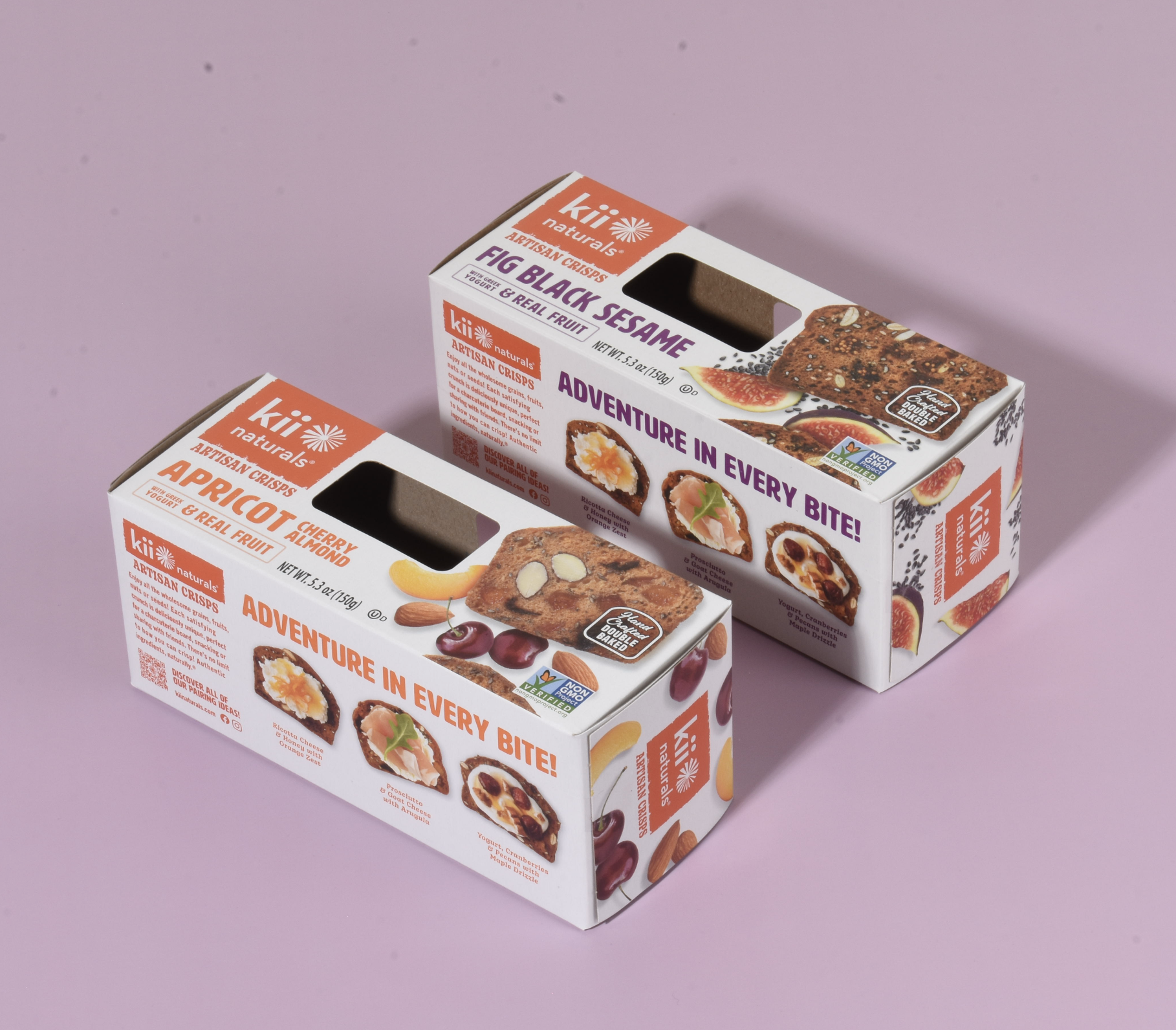
The project demonstrates how one carton structure can support multiple retail food SKUs. The brand, product family and information hierarchy remain consistent, while flavour names, colour accents and product imagery help shoppers distinguish each variety.
A rectangular opening on the top panel provides product visibility. Window size, placement and any transparent film specification must be engineered around product protection, packing and retail requirements.
Top, front and side panels carry branding, flavour identification, product imagery and consumer-facing information, making effective use of the carton’s available display surfaces.
Apricot Cherry Almond uses orange accents, while Fig Black Sesame uses purple accents. The shared structure and typography keep both packages recognizable as part of the same product family.
The orange Kii Naturals brand block remains in a consistent location, while large flavour names and crisp imagery create a clear information hierarchy when the cartons are viewed together.
Artisan crisps rely on visible inclusions and texture to communicate what makes each flavour different. The top-panel opening gives shoppers a view of the packed product while preserving large printed surfaces for branding.
The window, crisp photography and flavour ingredients work together. The outer carton carries product-family information and certification marks; it should not be treated as proof of the primary package’s moisture-barrier performance.
Kii Naturals’ official range includes numerous Artisan Crisps varieties. A repeatable carton architecture is needed so each SKU is recognizable as Kii while remaining easy to distinguish.
Logo placement, structure and typography remain consistent, while orange and purple flavour names, ingredient imagery and product photography distinguish Apricot Cherry Almond from Fig Black Sesame.
A consistent SKU system can reduce visual fragmentation across a product line and helps retailers and shoppers identify related varieties. The carton also provides additional panels for brand story, serving ideas and required information.
Product lineup and the brand’s double-baked positioning are supported by Kii Naturals’ official website. No shelf-life improvement, damage reduction or sales lift is claimed without validated project results.
A production quotation should confirm finished carton dimensions, product and inner-pack configuration, board specification, window geometry, any film requirements, printing coverage, coatings, packing method, order quantity and delivery destination.
For food packaging, the appropriate materials and direct- or indirect-food-contact requirements must be reviewed for the specific product and intended use. Beneco’s standard minimum order quantity is 5,000 units; final specifications, pricing and timing are confirmed during quotation.
Documentation note: This case study describes visible features of the finished packaging shown in the original project photograph. Exact paperboard grade, window material, printing process, coatings, dimensions, production quantity and performance outcomes are not inferred from the image.
Review the Custom Food Packaging Guide, compare SBS and recycled paperboard, or explore Beneco’s Packaging Guides.
Prepared byBeneco Packaging Technical Editorial Team
ReviewedAugust 24, 2026 · Editorial Policy
Share the product, structure, dimensions, window requirements, artwork, quantity and delivery needs with Beneco.